A backtest summary tells me whether a strategy made money. It doesn't tell me whether a stop moved at the right time, whether an entry landed on the intended bar, or whether a filter behaved sensibly during a trend. Those are different questions, and the second kind is where bugs hide.
For a while my routine was to export a run, open TradingView, and hunt down each timestamp by hand. It was slow enough that inspection usually happened late, once something already looked wrong, and that order is backwards. I built backtest-charts to make inspection cheap enough to do first: bars, saved fills, and indicator values on one interactive chart.
Flexible by design
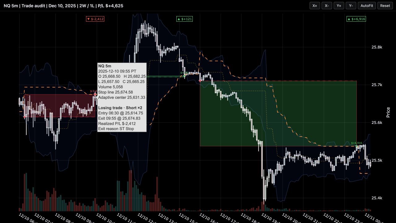
- Candlesticks, volume, trade boxes, entry and exit markers, and realized P/L, with full details on hover.
- Indicator lines, bands, levels, background regimes, event markers, and an optional equity curve.
- Regular market hours marked on the time axis, dead session gaps removed.
- One standalone HTML file as output, openable anywhere, shareable next to a research note.
The API doesn't know what a strategy is. It takes tables and series: any OHLCV frame, any trades table, any line, band, level, marker, or background mask. If the research produces a column of numbers, an agent can put it on the chart. That neutrality is deliberate, because each experiment needs different things visualized, and the tool shouldn't have opinions about what those are.
Zooming that stays out of the way
Navigation matches what a paid trading platform trains your hands to do: scroll zooms time while the y-axis auto-fits the visible candles, dragging pans, and dragging the price scale stretches the vertical range. A default web chart does none of this, and reviewing hundreds of trades is only bearable when the chart gets out of the way.
A closer look
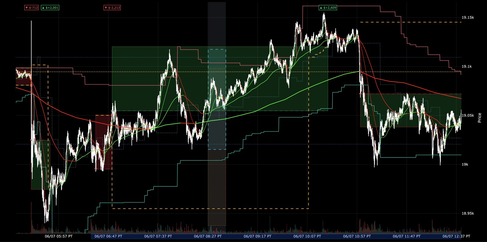
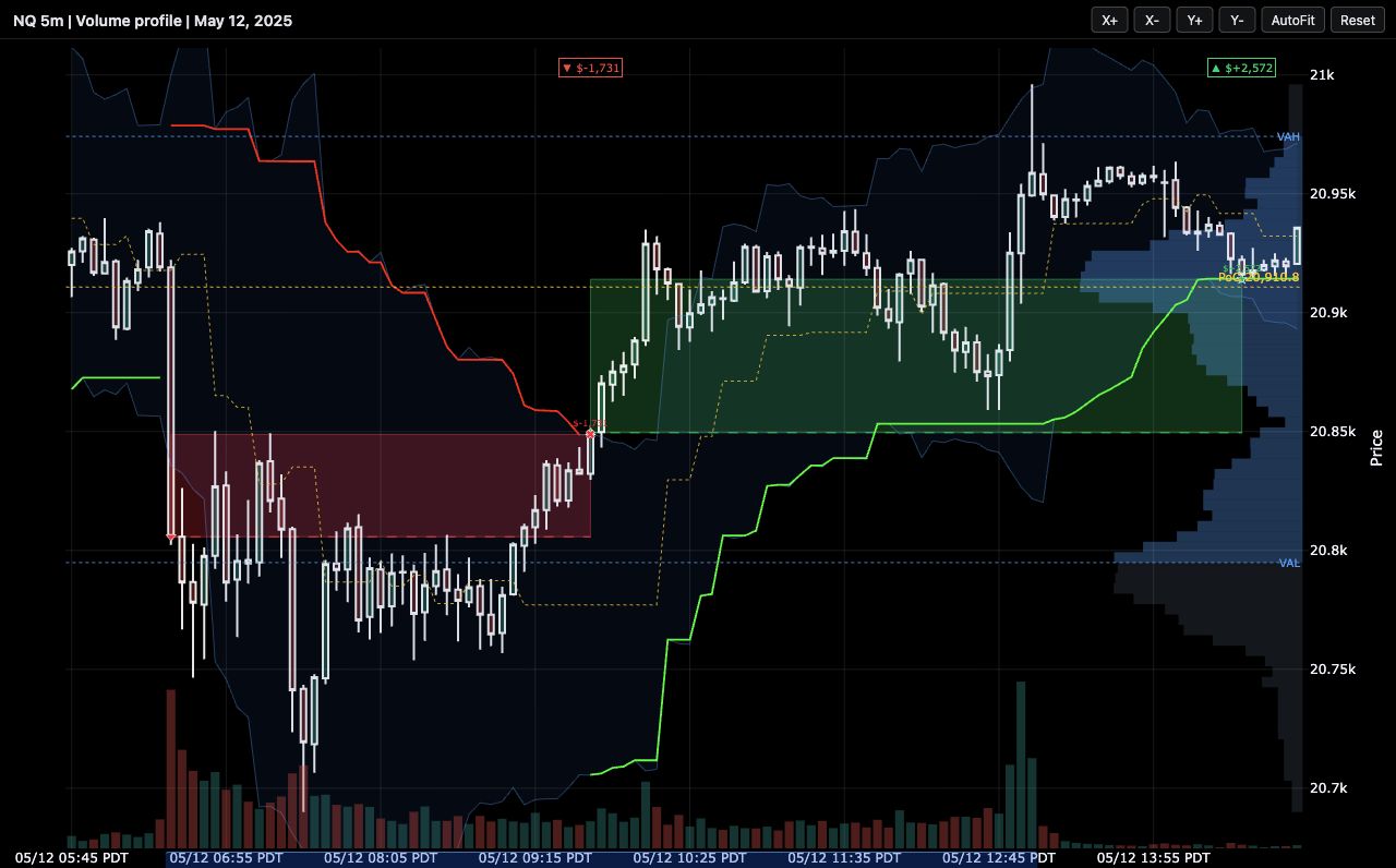
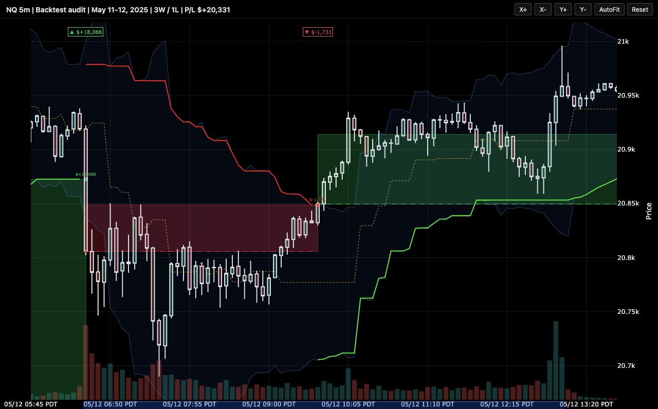
These examples use real NQ bars, at 15-second and 5-minute resolution, with saved backtest fills. The market data and strategies are not included in the public repository.
Why I use it
The clearest example was a chart that showed a consolidation filter switching on and off eighteen times during a single clean downtrend. The bug was mundane: the filter recalculated its range on every bar instead of freezing it while active. No summary metric flagged it, but on the chart it took seconds to see. Since then I split the job: statistics tell me how a strategy performed, and the chart tells me whether it behaved.
Built to be driven by agents
Most charts in my research loop aren't made by me anymore. Coding agents render them, because the API is plain Python calls an agent can compose: add an indicator line, shade a regime, place custom labels on the exact trades worth attention, and slice the window so the chart opens already zoomed to the two days that matter.
That changes what a chart review looks like. Instead of me scrolling through months of data, an agent hands me a small set of charts it selected and annotated: the biggest winners, the ugliest losses, and the trades that test the rule we're actually studying. The repository ships an agent skill file that teaches a coding agent the API and its pitfalls, so charts come back consistent no matter which agent built them. I describe how these audit sets fit into the wider research loop in the harness post.
Try it
The public package only renders. You bring an OHLCV table, a trades table, and whatever series you want to inspect:
import pandas as pd
from backtest_charts import TradeChart

bars = pd.read_csv("bars.csv")
trades = pd.read_csv("trades.csv")

chart = TradeChart(bars, title="Backtest review", symbol="NQ")
chart.add_trades(trades)
chart.add_line(stop_values, "Stop", color="#fb923c", dash="dash")
chart.add_band(upper_band, lower_band, "Volatility band")
chart.render("chart.html", include_plotlyjs="inline")
The result is a self-contained HTML file that needs no server or notebook, and whoever you send it to has nothing to install.
pip install git+https://github.com/rezwan05/backtest-charts.git
python examples/basic_usage.py && open examples/demo_chart.html
The demo runs on synthetic data, so no market data is needed. Source and documentation live at github.com/rezwan05/backtest-charts.